Specifications
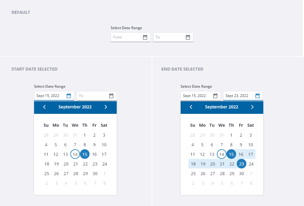
- Label: communicates the context of the input field(s).
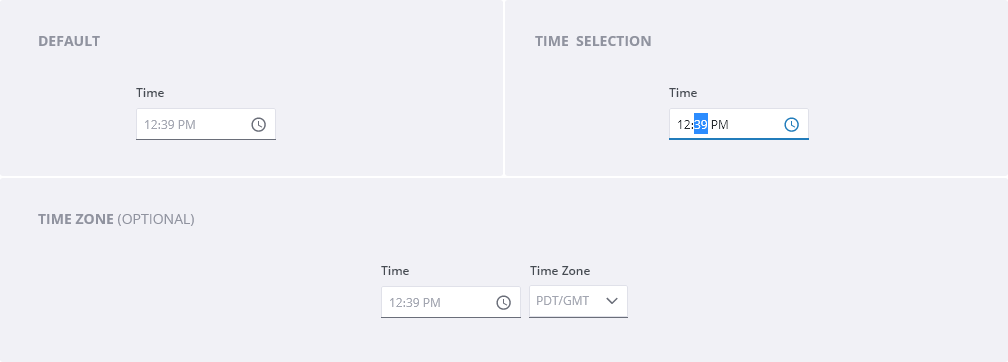
- Date/time field: text input where user can manually enter the date.
- Date/time format: format instructions should appear as helper text below or as placeholder text.
- Icon: use calendar and/or clock training icons in the input fields to communicate input field’s purpose and to activate the calendar popover.
- Month and year controls: allows the user to navigate through past or future months in sequential order.
- Week day labels: two-letter days of the week.
- Previous/ next month controls: allows the user to navigate through past or future monhts in sequential order.
- Day: days in the month with an indicator of today’s date and states.
- Time zone field (optional): allows the user to select a time zone from a dropdown menu.
Behaviors
Date Picker
- Clicking on the calendar icon opens the calendar view with the current date highlighted. Use the previous and next arrows to move through the months. Hover over the year and use the up and down arrows to move quickly from year to year.
- When the user clicks in the date field, change the field to focused, place the text cursor in the field to allow the user to enter date manually.
- Close the calendar view when a date is selected, when tabbing to the next field, or when a user clicks anywhere outside of the calendar view.
- Hovering over (or tabbing into) month and year in the header of the calendar displays up and down arrows allowing for navigation to another year. Left and right arrows change the month.

Date Range Picker
- When the user needs to filter/ search for an item (e.g. process, documents, invoice item) created within a specific time range, provide the ability for the user search within a date range.
- When the user clicks on the fields, follow the same behavior as date or time toggle.
- When the user hovers over a date in the future or past, highlight days in between, and highlight the day user’s cursor is over.
- The date in the “From” field will always occur before the date in the “To” field.
Invalid date range
- Scenario 1 - When the “From” date occurs after the “To” date: When the user inputs the date in the “From” field that occurs after the date in the “To” field, dynamically clear the “From” field on blur and the field stays focused.
- Scenario 2 - When the “To” date occurs before the “From” date: When the user inputs the date in the “To” field that occurs before the date in the “From” field, dynamically clear the “To” field on blur and the field stays focused.
Updating the date range
- When the user is editing an existing date range and chooses a new date in either field (“From” or “To”), adjust the timeline to reflect the new date.
- When the user manually enters the date in either field (“From” or “To”), display the entered date range in the calendar.

Time Picker
- Use the time picker input box to type in a specific time in hours and minutes.
- Clicking into the time zone dropdown, displays a list of time zones.

Editorial
- Label: keep field labels short and informative. Use title case (only capitalize the first letter of each word) and describe the information that is being requested. Place labels directly above the field and align them to the left.
- Placeholder text: Use the placeholder text to prompt the user to enter the correct data format. Placeholder text can either be today’s date or mm/dd/yyyy.
